
Colour Theory: Designing Boutique and Five Star Hotels
Colour is a powerfully emotive language, it surrounds and has a profound influence on how we think, feel, and behave. How aware are we that this is happening? Our response to colour is often immediate, and its effects can be transformative.
"COLOURS, LIKE FEATURES, FOLLOW THE CHANGES OF THE EMOTIONS." - Pablo Picasso
Whilst our response to colour is often deeply personal, there are guiding principles of colour psychology which apply to designing in both communal and individual spaces alike. Successful hotel designs understand the crucial role colour psychology plays in impacting guests' perceptions, emotions, behaviours, and the overall guest experience.
We must think far beyond aesthetics. How do you want guests to feel during their stay and what constitutes a good night's sleep?
WOOLF Interior Architecture & Design explore the aspects of colour psychology which connect the functional use of a hotel space with the aesthetic details that make it memorable.
ATMOSPHERE AND AMBIANCE

Four Seasons, Jumeirah Beach Dubai
Colours have the power to create distinct moods and ambiences, particularly effective when complemented with a considered lighting plan. We carefully consider colours to create the desired atmospheres in different areas of a hotel such as the reception, restaurant, and guest rooms.
Strategic use of colour can also enhance the desired functions of these areas, this might include stimulating social interaction or easing the guest into a state of relaxation.
Warmer colours create a cosy and inviting atmosphere, whilst cooler colours like blues and greens can evoke a sense of calmness and tranquillity. Our international, high-profile commercial project for The Four Seasons Jumeirah Beach in Dubai established an opulent yet intimate feel.
FIRST IMPRESSIONS COUNT
A welcoming hotel reception featuring calming colours can quickly put the guest at ease, bolder choices make for a more dramatic entrance delivering the ‘wow’ factor.
The all important first impression sets the tone for the guests' stay and establishes brand recognition.
PERCEPTION OF THE SPACE
Colour is one of the basic elements of visual perception. It can have a profound effect on perceived room dimensions, whether employed to change the perceived size of a room or to visually re-proportion to the space.
Lighter colours are considered ‘receding’ and tend to make spaces feel larger and more expansive, while darker or ‘advancing’ colours can draw the space in and create a sense of intimacy.
GUEST COMFORT AND WELLBEING
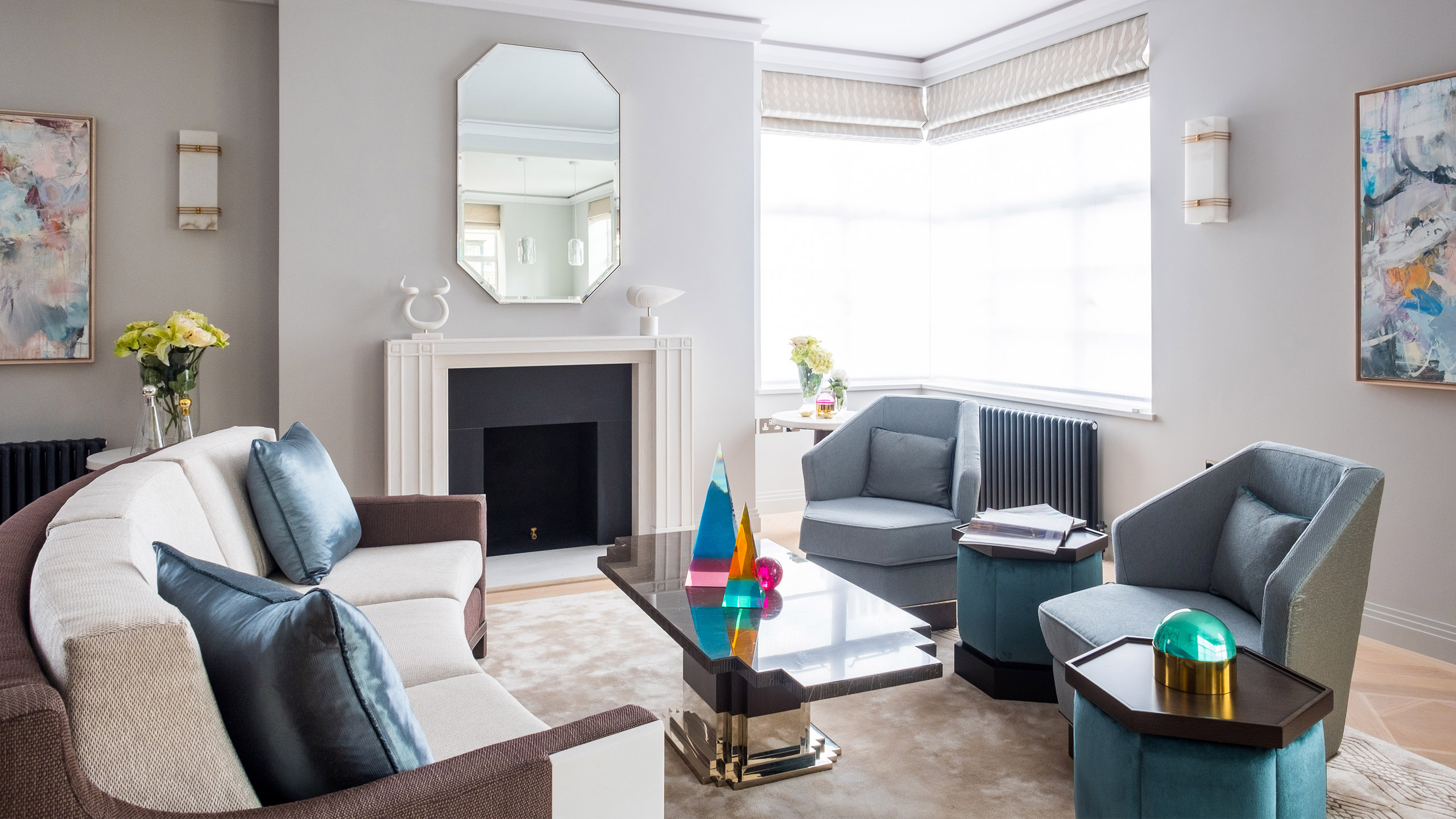
Belgravia House Hotel, Belgravia London
The effects are measurable - colour has the power to raise or lower our heartbeat, stimulate the circadian rhythm, and increase or decrease metabolism. For example, soft, neutral tones promote relaxation whilst oranges and reds stimulate the senses - and the appetite! Colour choices can even impact perceptions of cleanliness and hygiene - crucial considerations for the hospitality industry.
CIRCULATION AND NAVIGATION
Differentiated colour schemes are wonderful tools for creating distinctive zones within a hotel space, both aesthetically and functionally. Colour schemes also act as navigation tools allowing the guests to circulate around the space more easily, creating a seamless and enjoyable experience.
CREATING A DISTINCTIVE BRAND AND IDENTITY
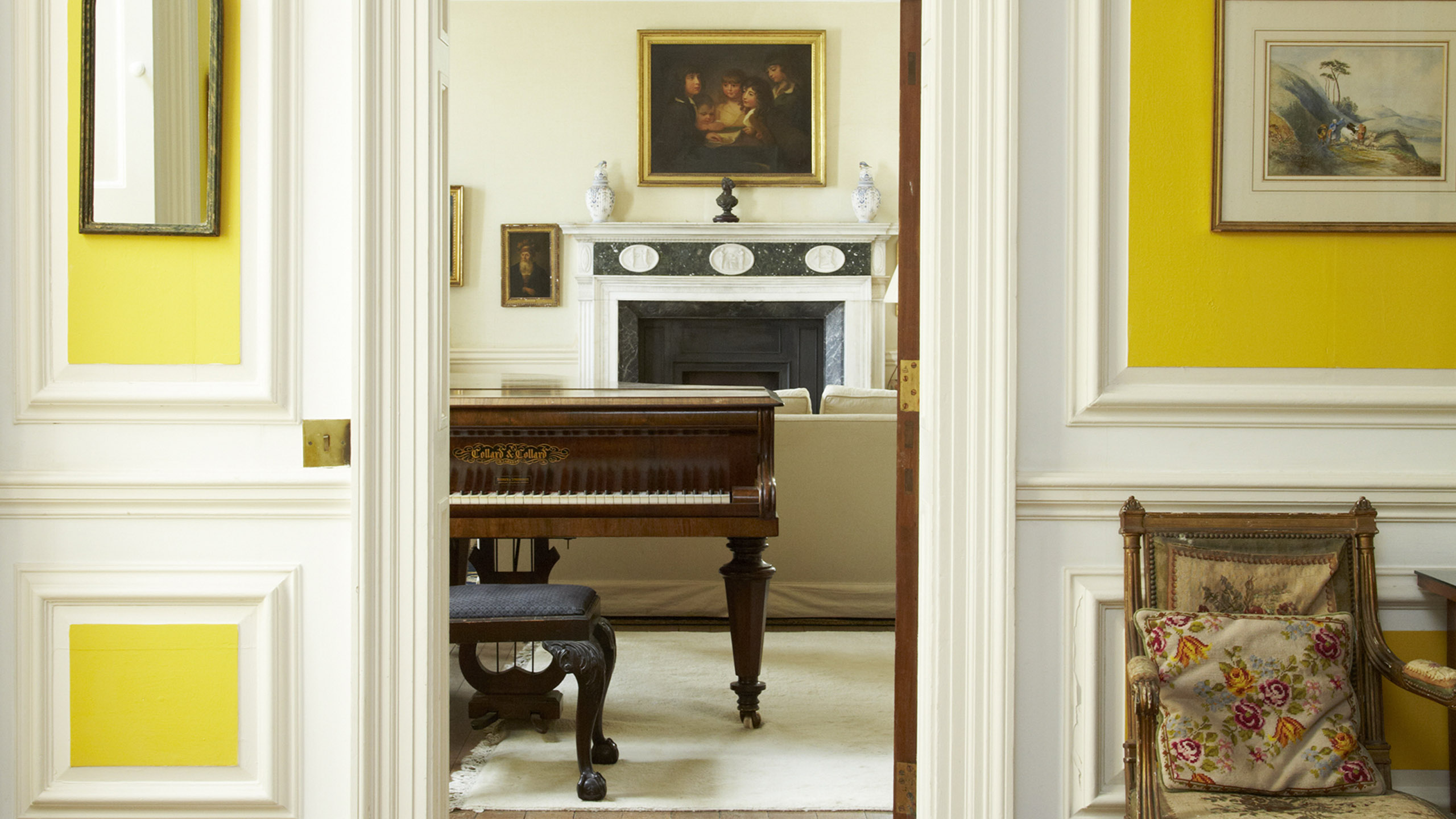
Poundon House Hotel, Oxfordshire
When colour schemes remain authentic to a brands DNA and vision, they can encompass the entire guest experience and reinforce the emotional connection with the brand. Colours convey personality, they set expectations, and they differentiate a brand from the competition. A considered colour palette should offer consistency across key guest touch points.
BACK TO NATURE
Introducing natural elements to a space greatly impacts one's emotional attachment to it. Selecting a natural colour pallette, just one component of biophilic design, can enhance hotel guests' emotions, overall satisfaction, and has even been shown to affect booking intentions. For a recent hotel project, HOMETOO, the interior design was created on the theme of colour theory.
CULTURAL CONSIDERATIONS
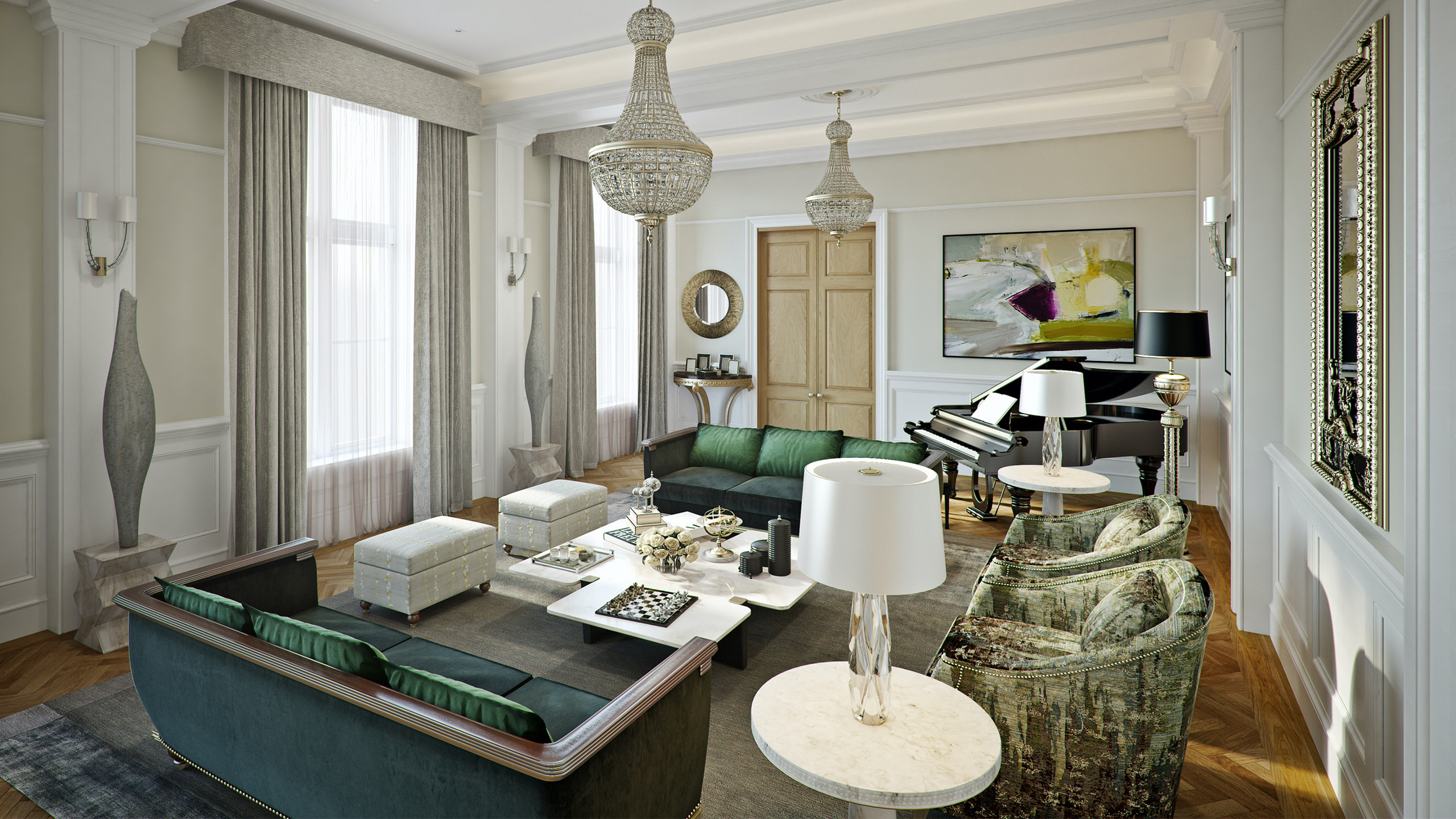
Oceanic House Hotel, City of Westminster London
In an increasingly diverse world, it’s essential to consider the cultural context of colours, and especially important for hotel brands with global presence catering for international clientele.
A colour which signifies luck in one culture might symbolise something entirely different in another, while white symbolises purity and simplicity in Western cultures, but represents mourning and sadness in some Asian cultures. Culturally sensitive colour choices help your brand resonate with a wider audience (and avoid any unfortunate misunderstandings!). You can find out more about our work in hotel consultation that includes colour and narratives here.
We are far more influenced subconsciously by colour than we realise. The considered and strategic use of colour in hotel design not only drives the emotional connection between the guest and hotel brand, it creates award winning hotel designs and exceptional guest experiences.