
Country & Town House 'Great British Brand 2026'
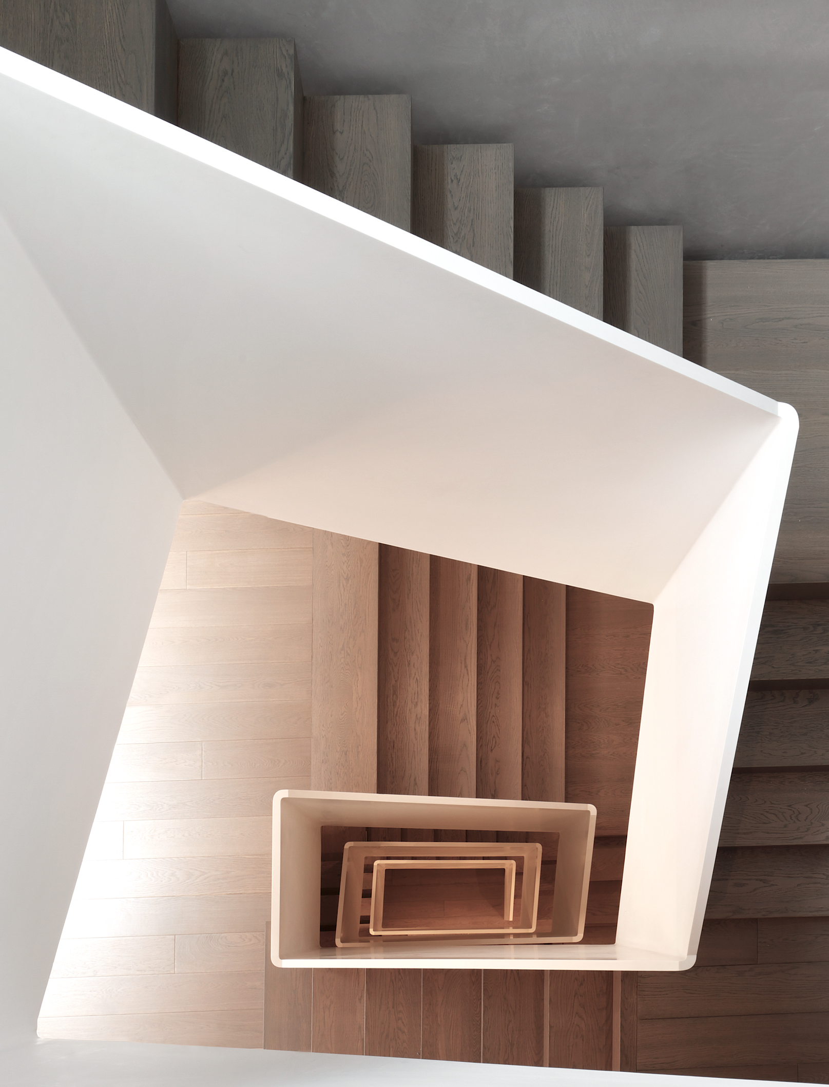
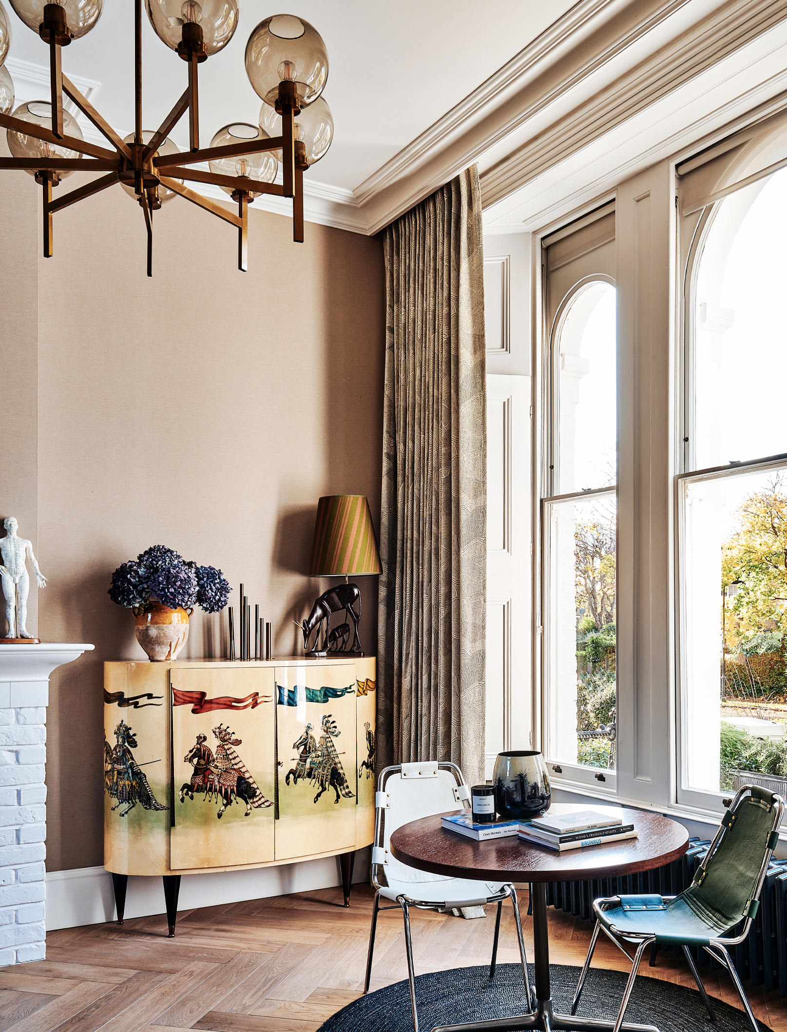
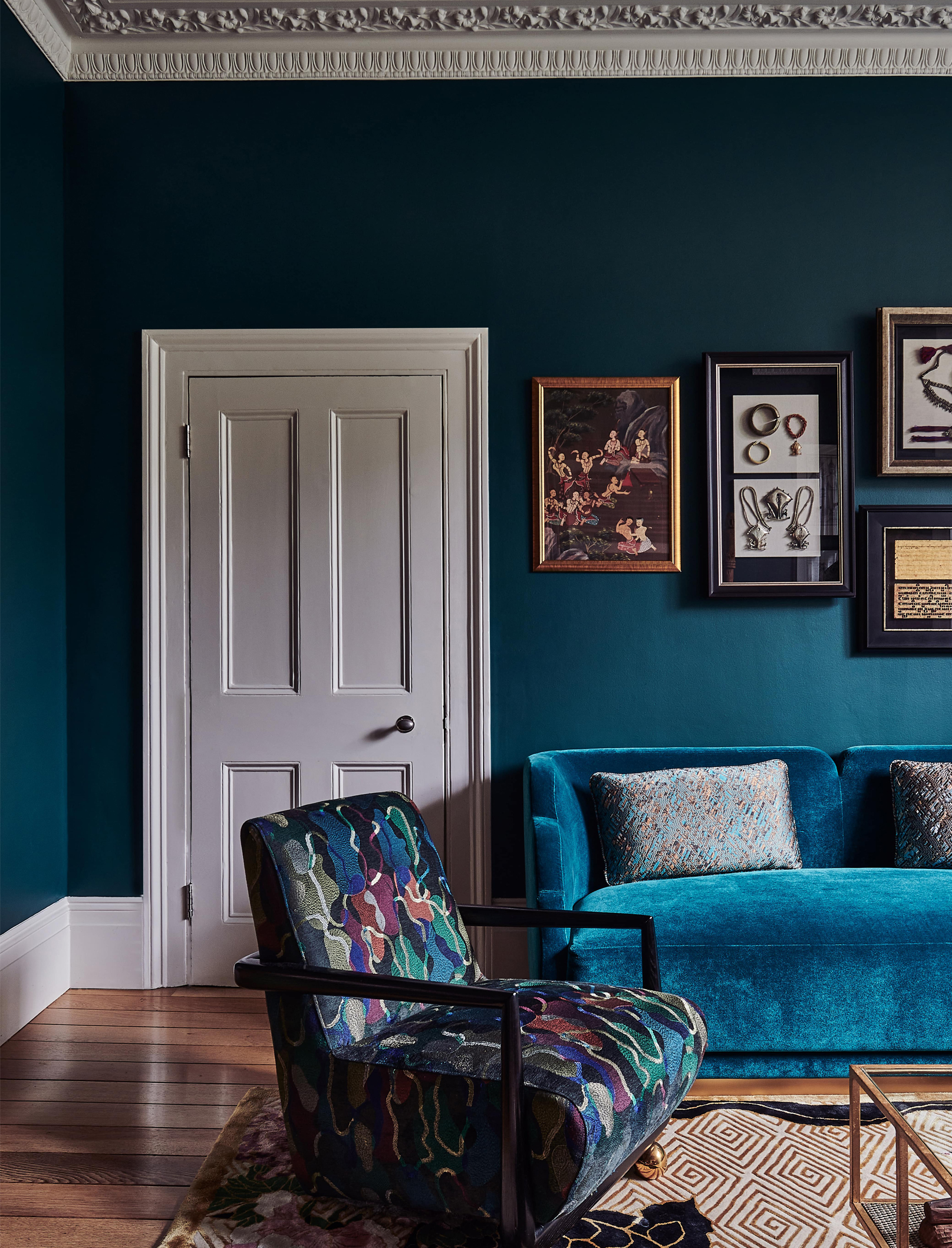
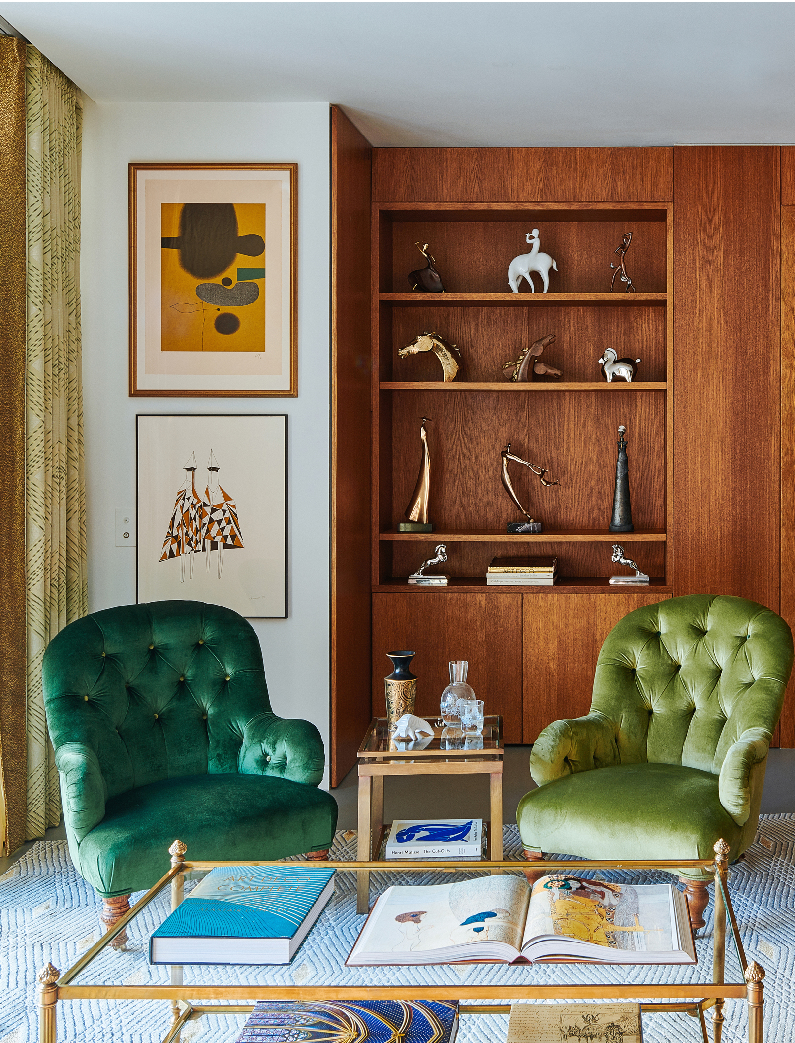
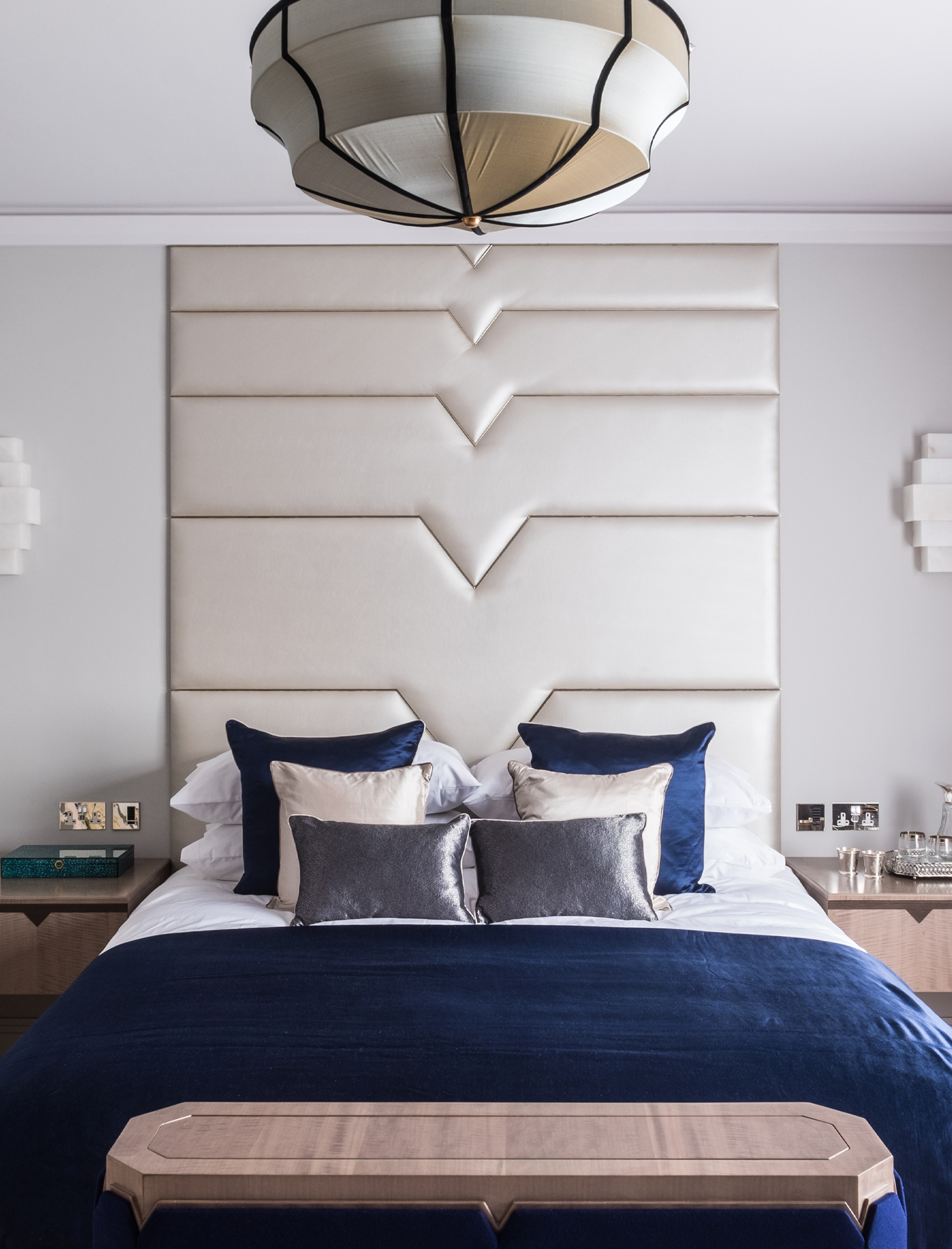
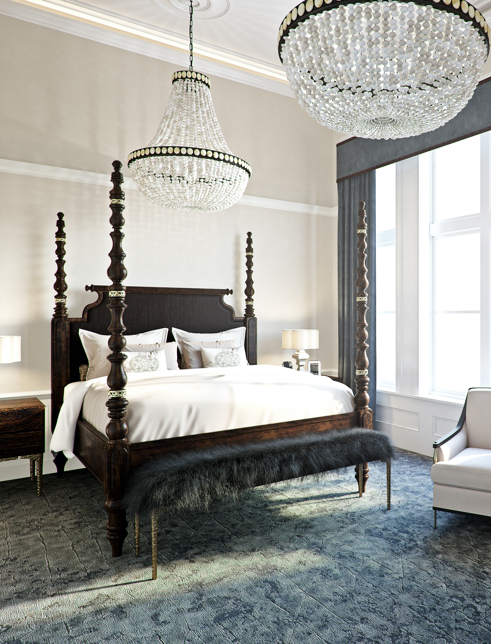
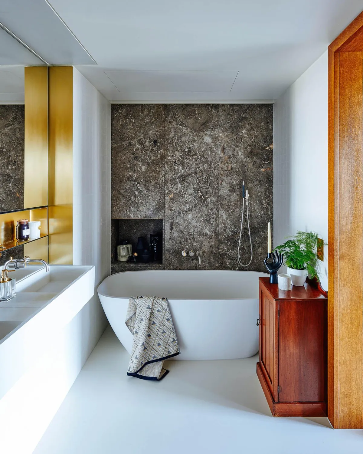
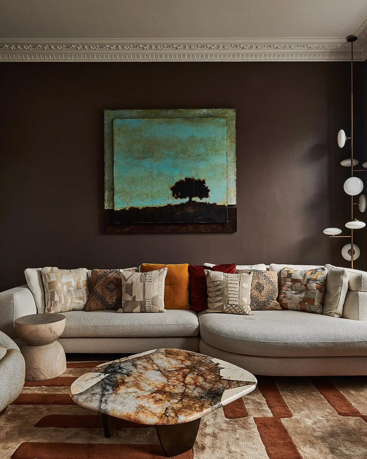
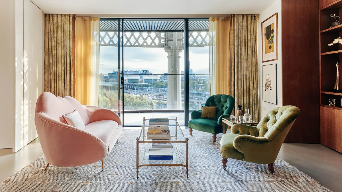
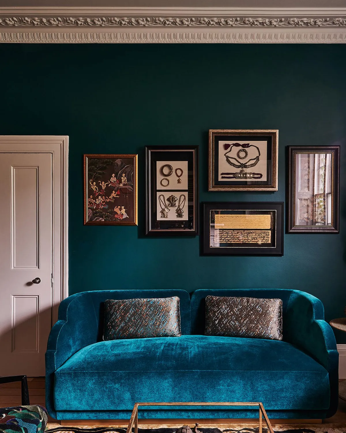
RESIDENTIAL Interior Design
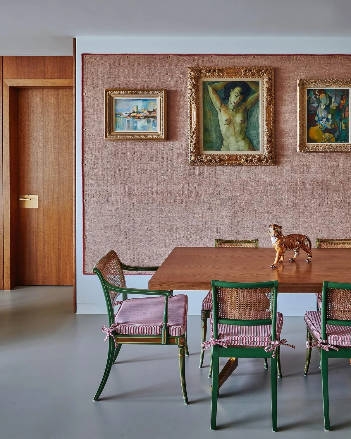
The client journey is an experience that is creative, imaginative, surprising, and fun.
Our projects blend tradition and imagination to create homes with a sense of balance, warmth and refinement. We design distinctive interiors tailored to reflect the aesthetics and vision of our clients.
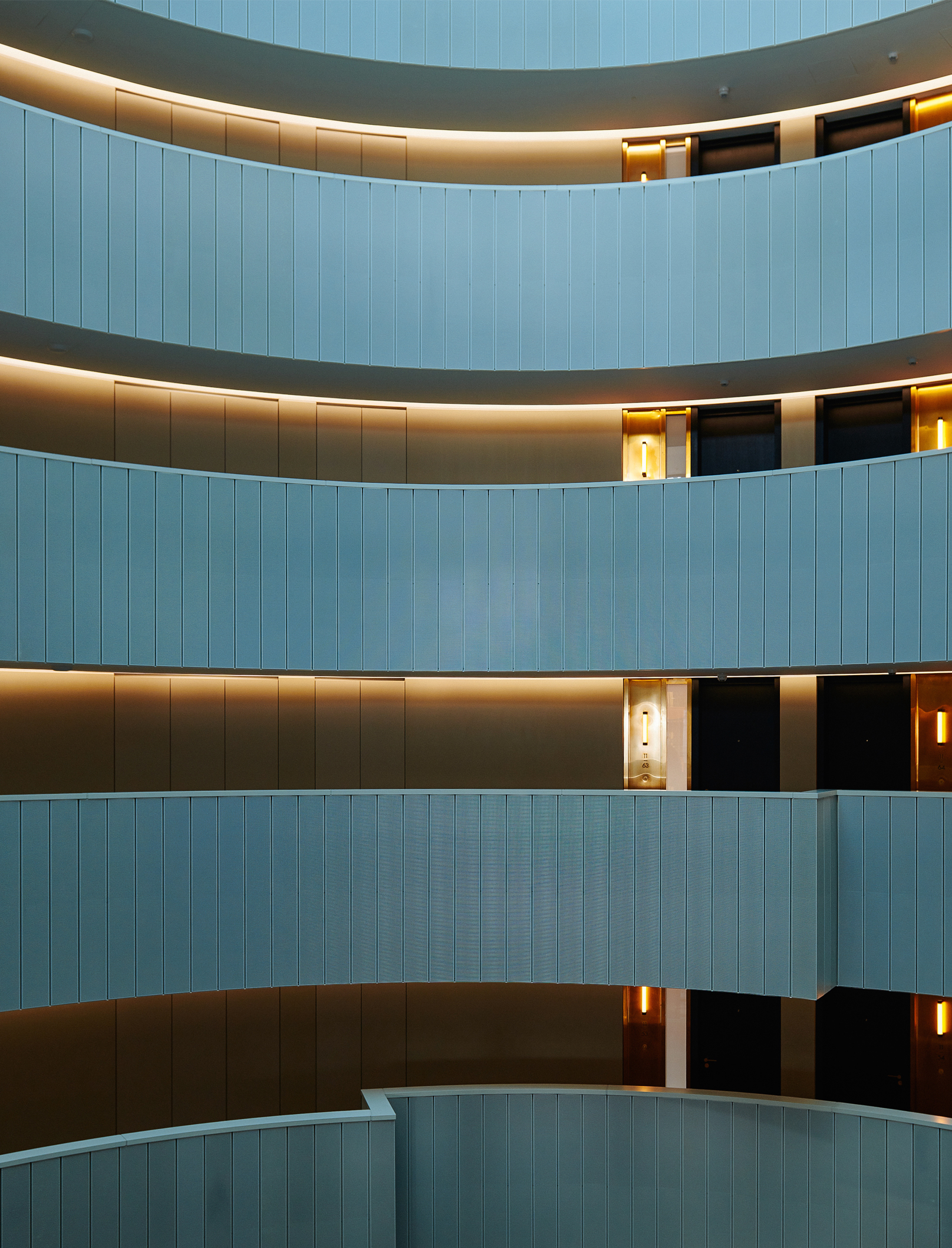
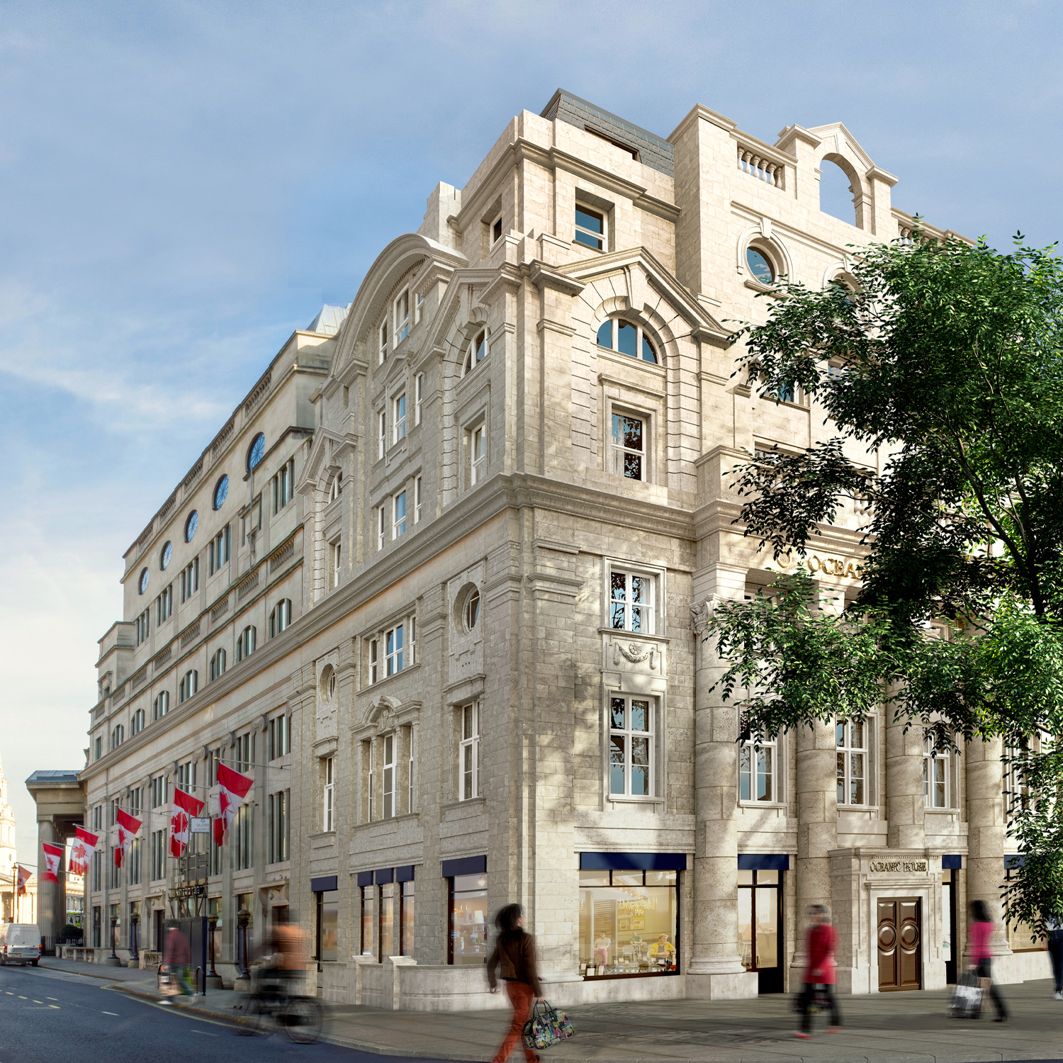
Commercial Interior Design
Designing brand-led, boutique hotels and exclusive members’ clubs.
As a leading interior design studio, we draw upon decades of experience and expertise to deliver a multidisciplinary interior design service for hotel groups, independent operators, and private investors.
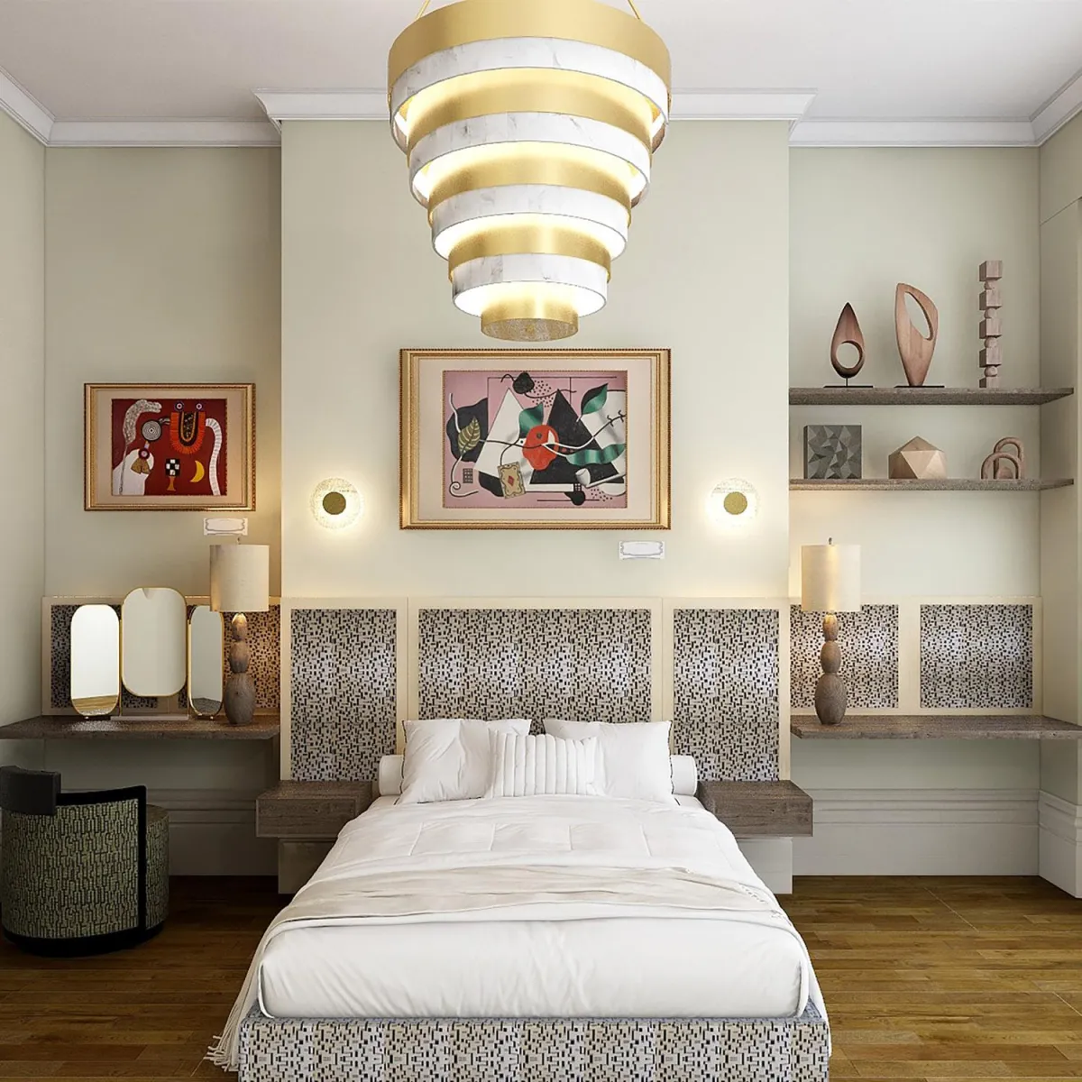
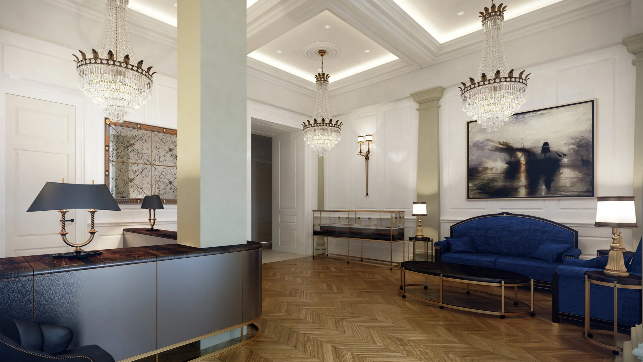
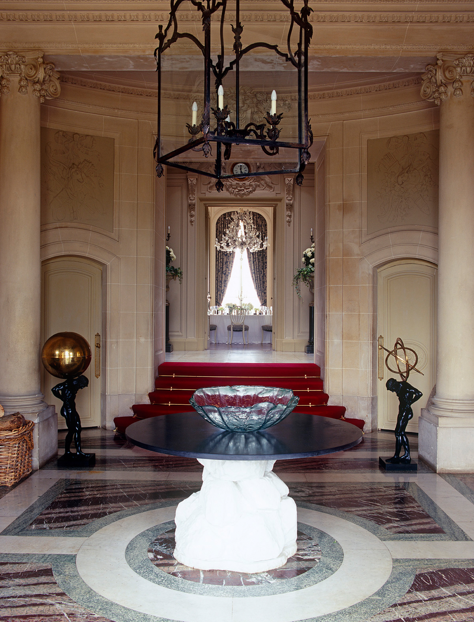
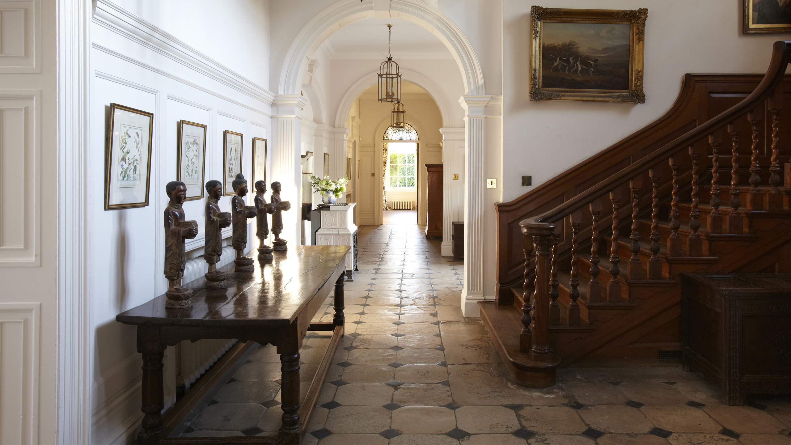
Historic Interiors
Re-imagining listed interiors for future generations.
Known for our specialist expertise designing Grade I and Grade II listed properties, WOOLF is an accredited historic interior design studio. We take time to thoughtfully address our client’s current and future needs, delivering richly layered historic interiors.
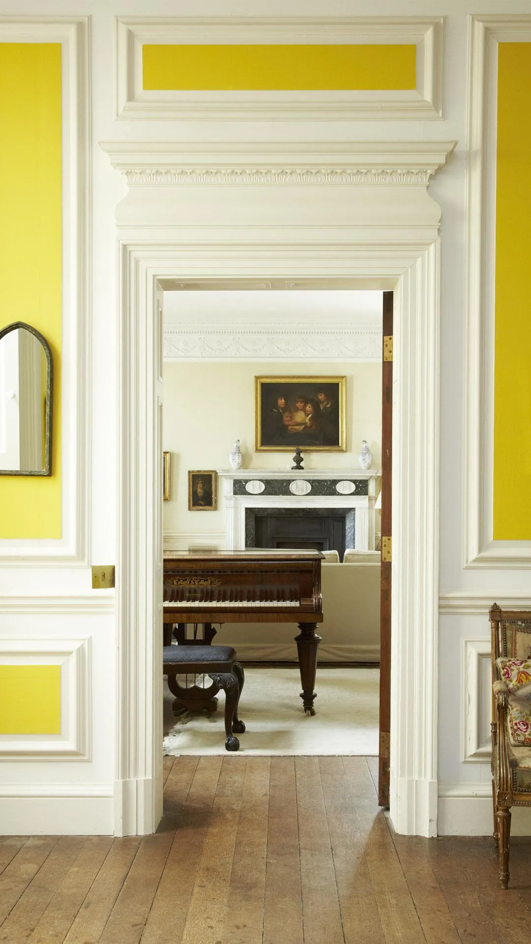
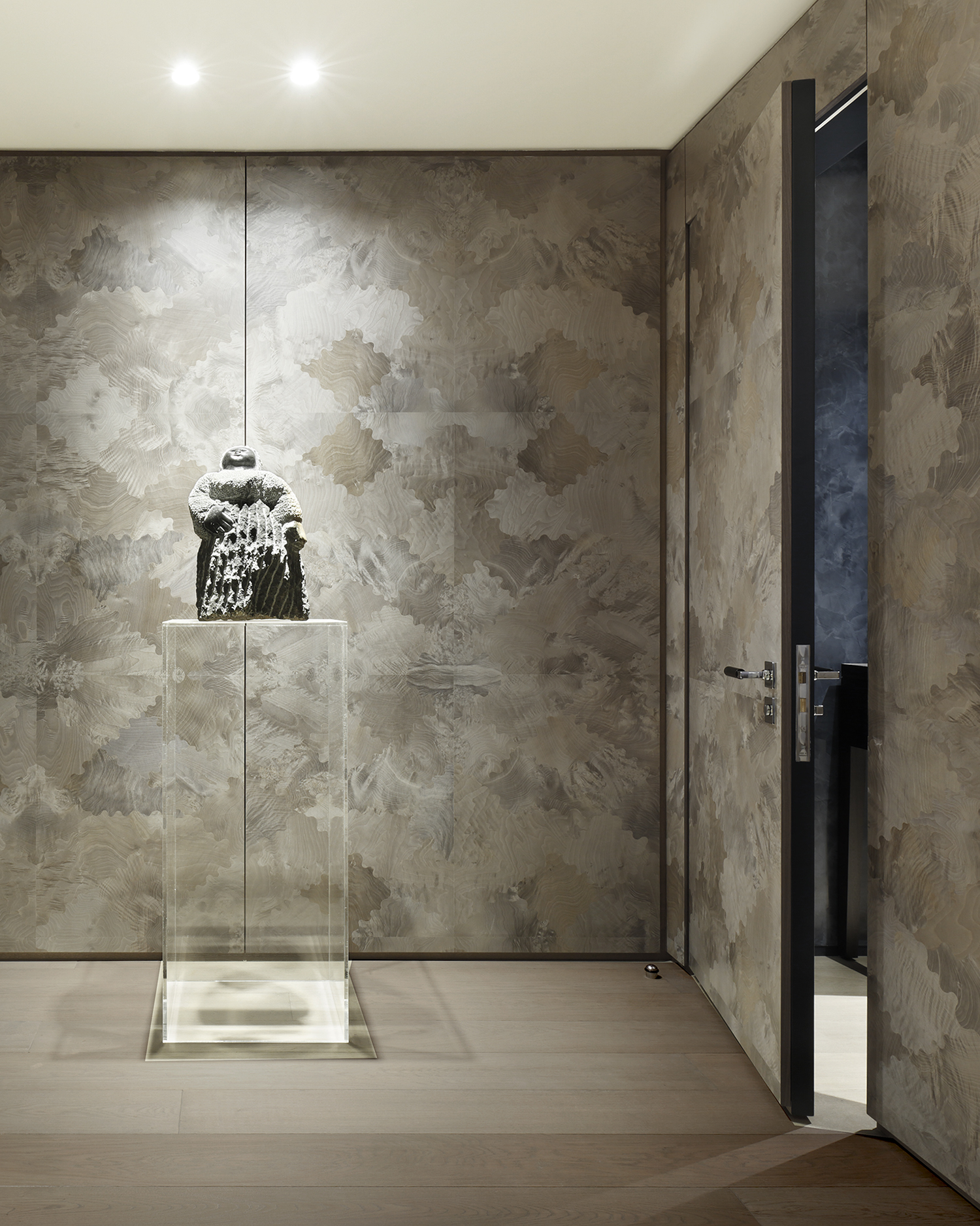
Curating Artwork
Maximising the impact of artworks and collections, showing them in a fresh light.
Sourcing distinctive artworks, uncovers hidden gems, and refines or curates’ art collections with a considered approach. Through a trusted network of artists, galleries, and dealers, each piece is thoughtfully selected to create harmonious, meaningful spaces with meticulous attention to detail.
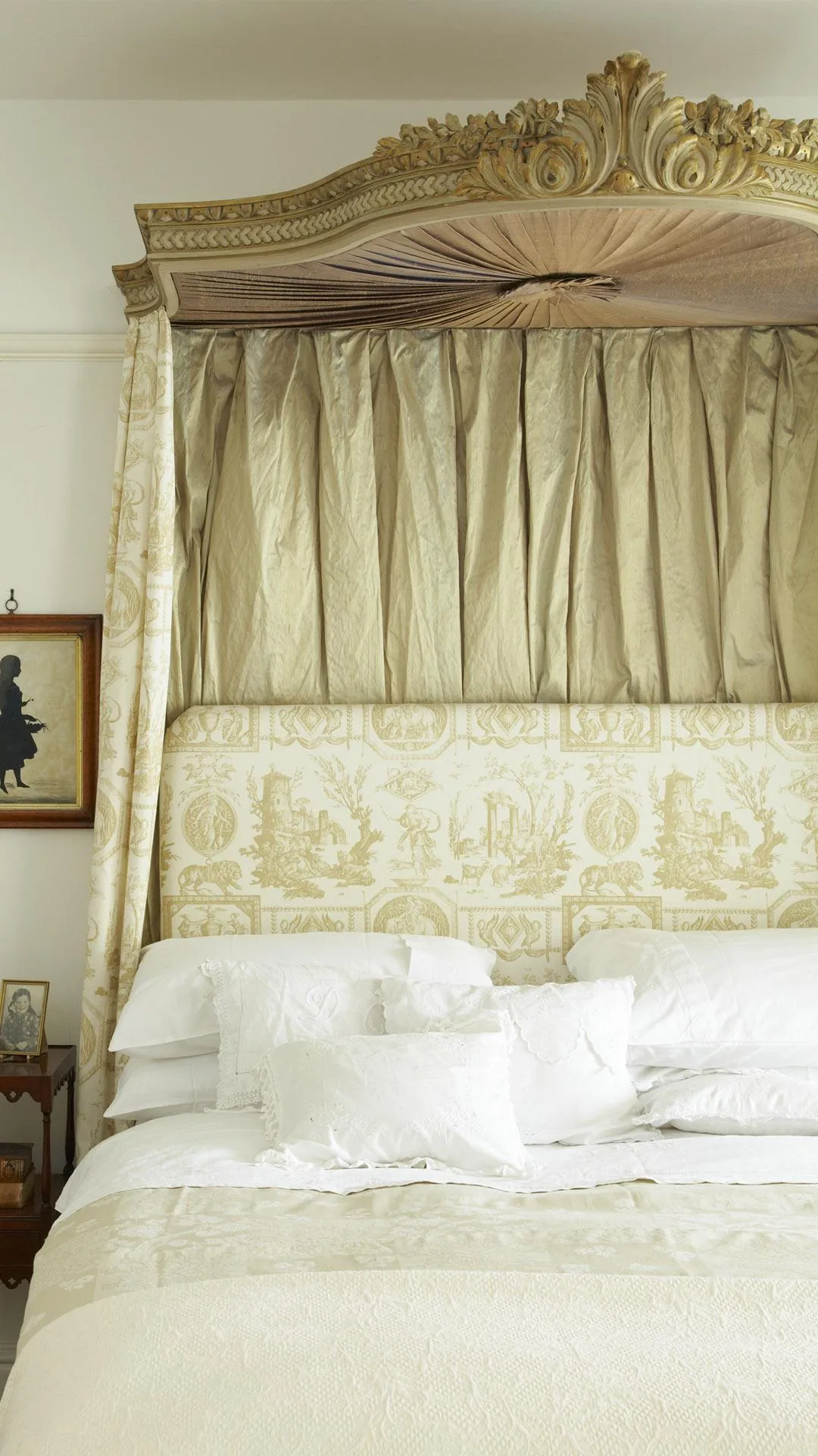
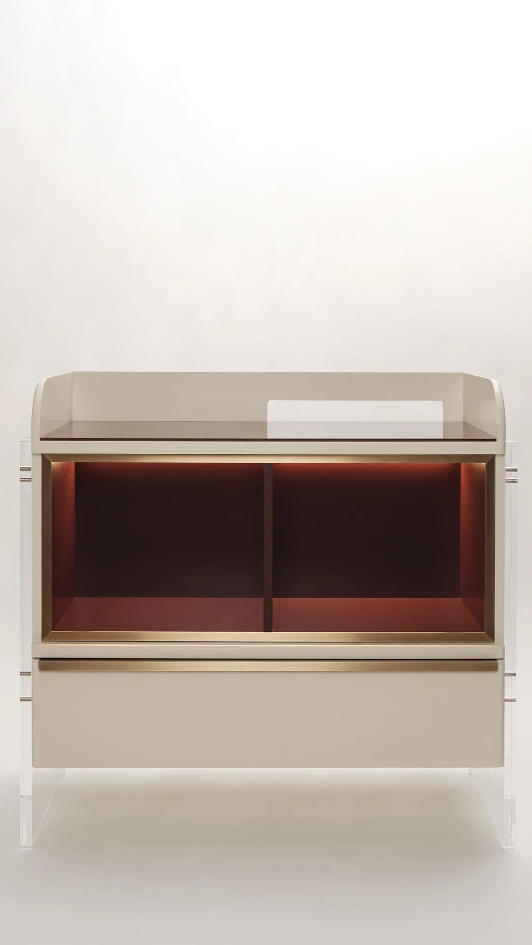
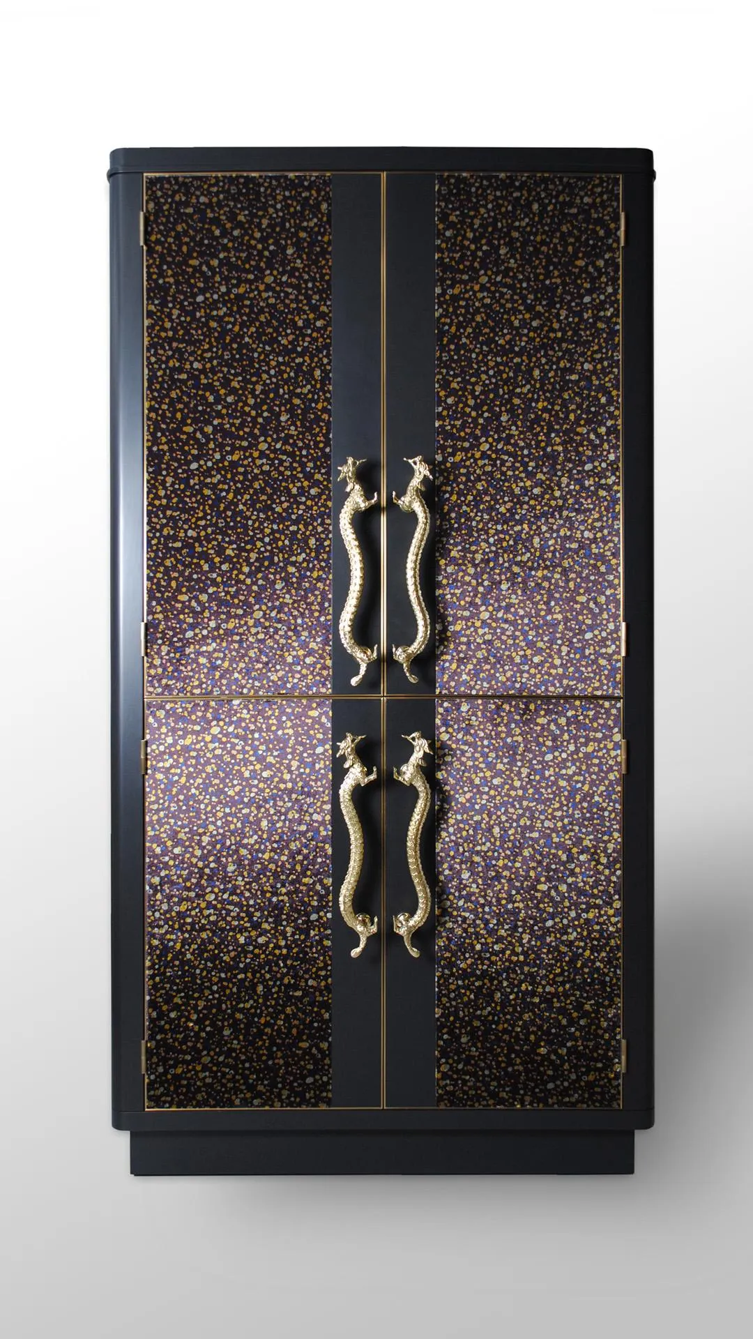
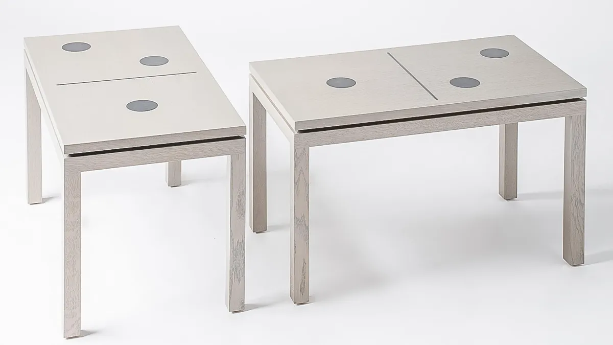
BESPOKE INTERIORS
A skilful combination of personalised furniture and joinery.
WOOLF Interior creates bespoke designs brought to life by highly skilled artisans and master craftspeople. Using only the finest materials and refined techniques, each scheme is carefully considered, expertly executed, and designed as a lasting investment with longevity at the core.
Our Award-Winning Design Studios Create Houses and Hotels with Unique Personalities